What is color space?
25 May 2020Years ago I found this post about human color perception and computer colors, which I found super helpful in understanding what gamut, sRGB, gamma and such actually mean. Here I try to summarize the main points.
Human Eyes are terrible
We often say that red, green and blue are the three primary colors, and our eyes also function in a similar way. Unfortunately, the cones in our eyes does not have a perfect distribution of sensitivities to detect the three colors.
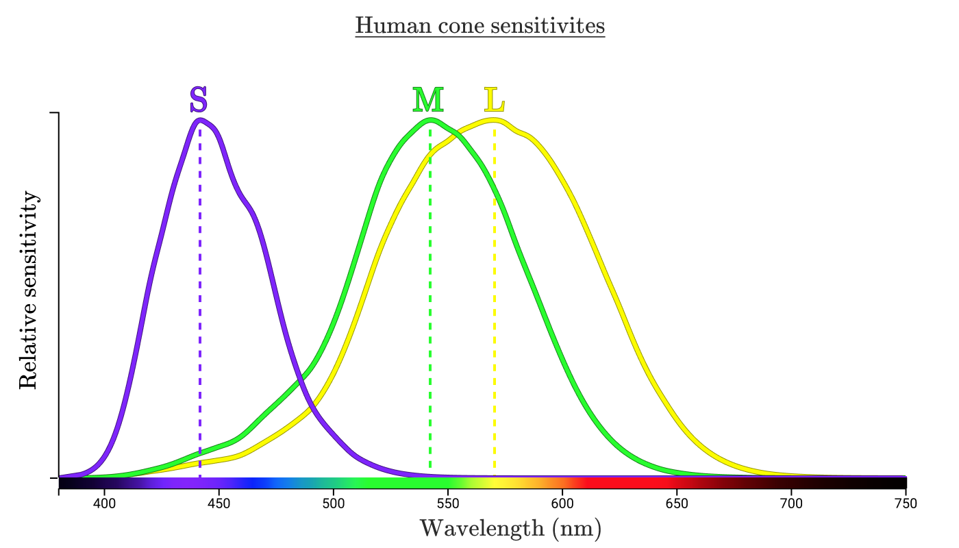
As shown in the diagram, we use SML to label the 3 types of cones in our eyes, and the M & L cones have significant overlap. In theory, we can use (S, M, L) to define any color on the horizontal line, called spectral colors, that we can perceive. This is called the LMS color space.
Color Matching
The problem comes when we try to use a combination of Red, Green and Blue light to reproduce a spectral color we can see. Scientists in 1920s decided on some wavelengths of Red, Green and Blue, shined a combination of them on one side, and a pure color wavelength on another side, and adjusted the combination until they look identical. Because of the large overlap between the M & L cones, we cannot produce green without unwanted stimulations to the Red cones. By experiment, they found that a lot of the cyan and blue cannot be reproduced unless we add red to the other side, meaning that we added negative amount of red to our mix of colors.
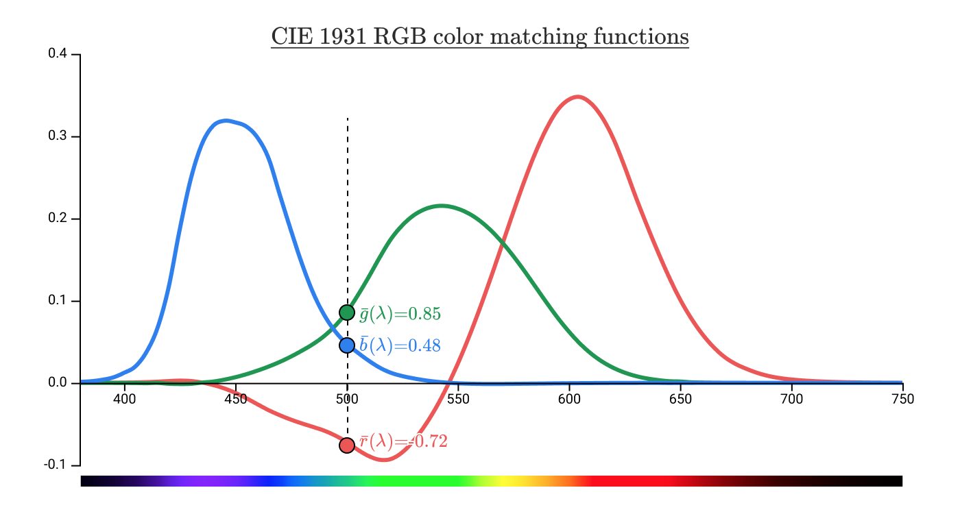
Scientists then transformed this plot to put the intensities of RGB on the axis. To avoid having to make a 3D plot, they fixed the resulting color’s intensity so that Blue is always (1 - Red - Green) / intensity. Then we can have a 2D plot showing all the possible colors of a certain intensity. This also has the added benefit that we are no longer limited by spectral colors, and can represent colors which is produced by combination of multiple frequencies, such as pink.
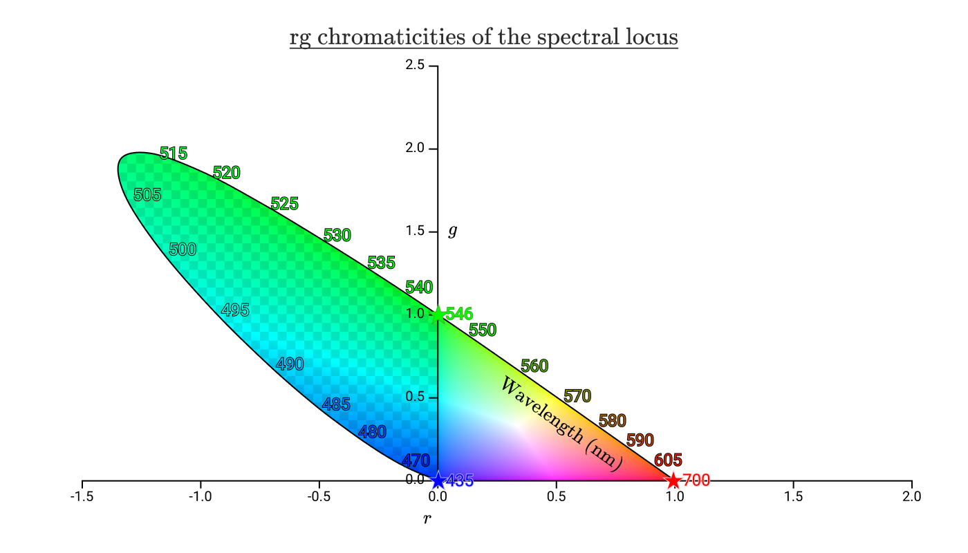
We can still see the area where we would need to add negative amount of red light to reproduce, and now this looks similar to the color space plots we see. Since the scientists in 1931 didn’t like negative numbers, they used a matrix transformation to put the entire area in the positive region. This unfortunately removed the axes’ original association with RGB, and is now called XYZ.
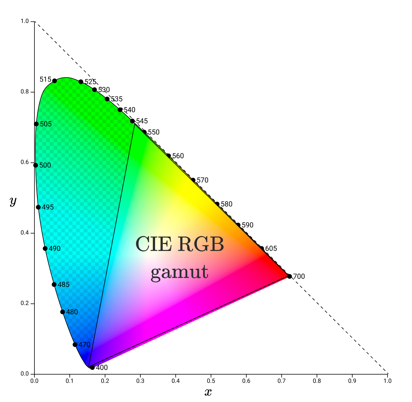
Subsequently, all the sRGB, Adobe RGB, Rec. 709 color spaces can be shown as some area in this plot, while your color lasers will be somewhere at the perimeter of the plot, depending on its color. When we want to reproduce a color using RGB, we can read a point on the plot and get the (R, G, B) values of it.
Gamma
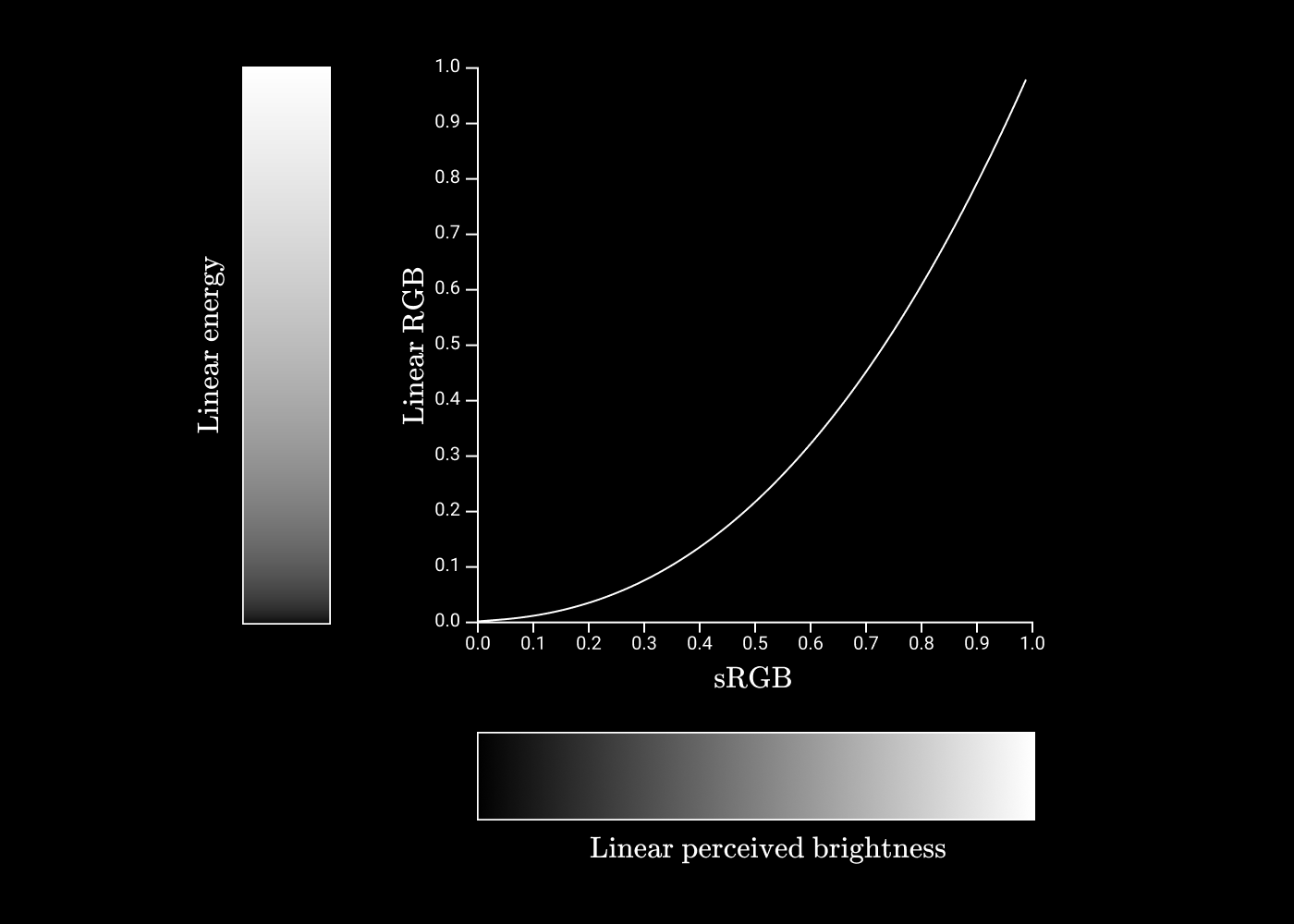
But the story is not over. We still haven’t solved the intensity problem, because the plot only show colors at a fixed intensity. Here’s where our eyes come in again. We are way more sensitive to changes in dim light than in bright light. I guess it has something to do with the cones and rods getting saturated and cannot produce a stronger neural signal. When plotted it would look a power curve, which is exactly what they chose. When we say the standard gamma is around 2.2, we mean that we are mapping the linear intensities to a curve of power 2.2 to make it more linear when perceived.
Color profiles (ICC)
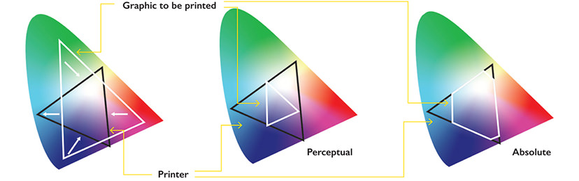
We mentioned color spaces like sRGB and Rec. 709, and we often need to work with a different color space depending on the hardware or specification used. Without some standard way of converting between them, colors would look wildly different across different devices. Here’s where color profiles come in. They define a standard transformation between different color spaces, either by mathematical formulae or by Look Up Tables. These are called mappings, and the same transformation can also have different mappings according to the rendering intent. For example, Relative colorimetric would usually preserve hue and lightness at the cost of saturation (when you transform to a narrower color space, colors may look more muted), while Perceptual is a slightly stylized intent that aims to be pleasing. Here’s a diagram from snapshot: